
Per Lei, The brand wanted to refresh its expression with a more colourful, playful direction aimed at a younger, social-first audience. The brief was intentionally open: bring more colour, energy and playfulness into the brand. I explored how far the existing identity could be pushed without losing recognition. So I developed several visual directions exploring colour, typography, photography and mixed-media elements. The selected direction became the foundation for the new visual language. I kept the existing logo and core brand elements, using them as a recognisable foundation rather than starting from scratch. I introduced more expressive typography and unexpected type combinations to move away from a generic beauty aesthetic. A brighter and more playful colour approach helped give the brand more energy and made the communication feel more relevant to social platforms. I combined photography with graphic elements, typography and illustration-like details to create a more flexible and playful visual language.

CLIENT: Per Lei ROLE: Graphic Design & Brand Design
YEAR: 2022 SOFTWARES: Illustrator, Figma & Photoshop
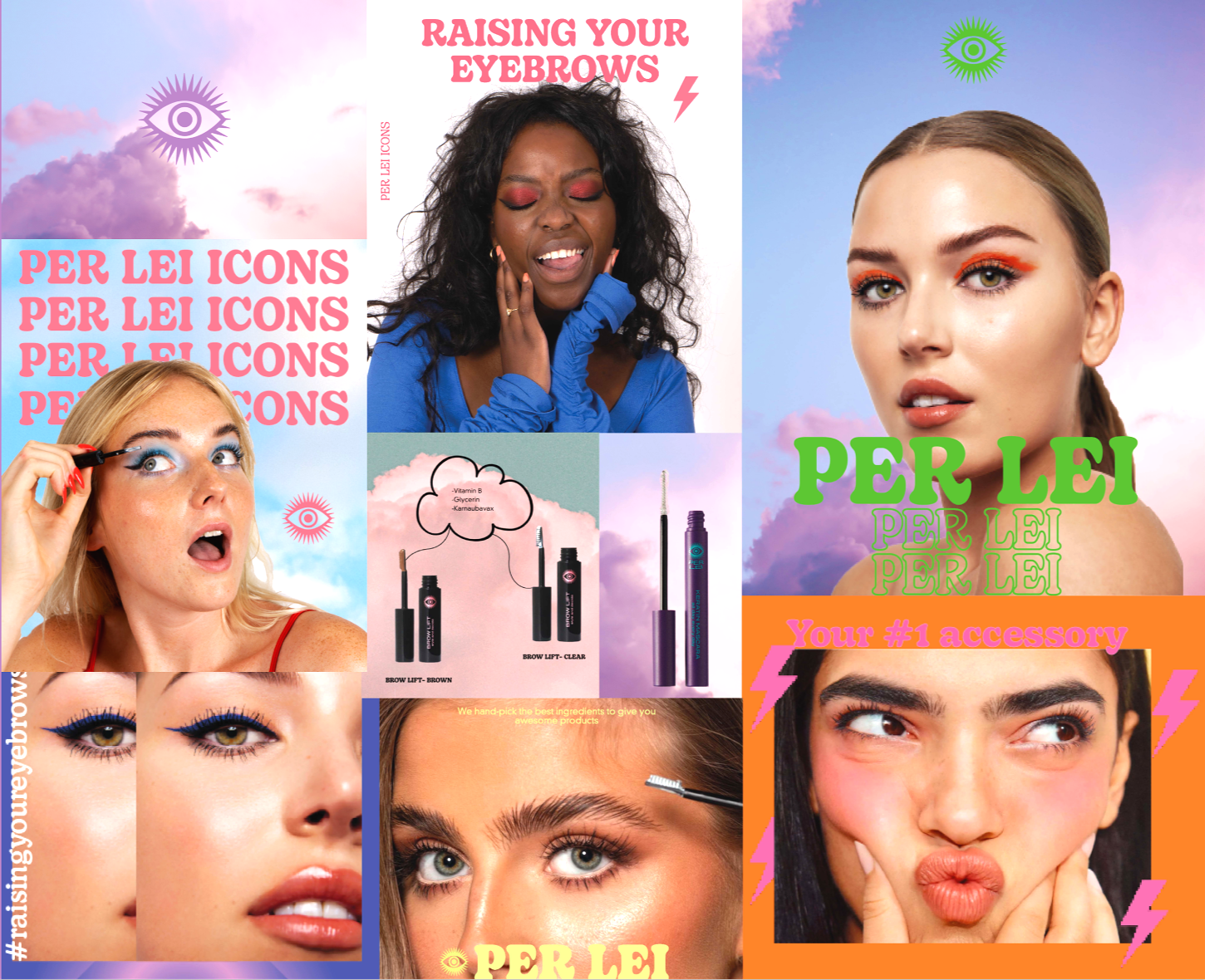
Moodboard
Colors
#A37FB1#ee778a#ef833f#36d330#98cddb#e0f77c#e6a3c3#4b569c
Digital ads & Campaign




Social Media

Digital newsletter